There are great advantages with sharing information, people will gain understanding, you will get relevant feedback, etc. The best way to share information is of course not to share, but to elicit it together. Lacking that, visualizing (i.e. presenting it in a clear and precise way for the intended target group using pictures rather than words) the information is second best.
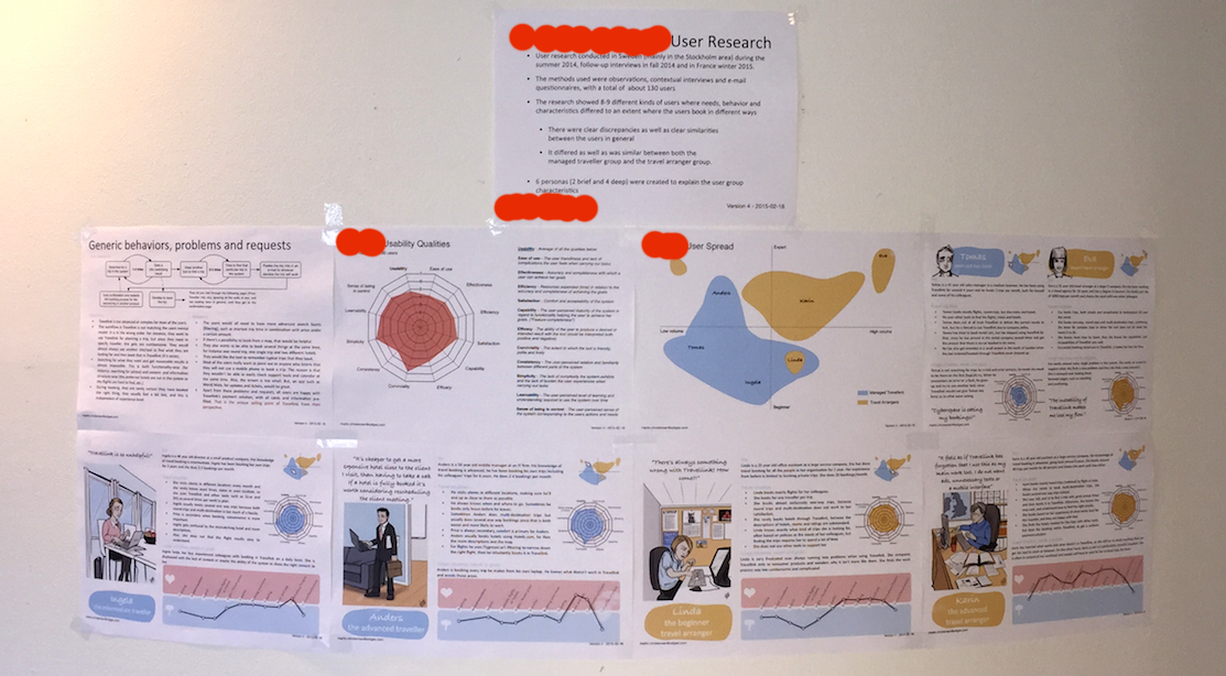
While working at a travel agency, I did a lot of user research basically on my own. I met and interviewed around 30 people in 2 countries and reached out with a couple of surveys to an additional 100 in 3 countries. The knowledge I acquired had to be distributed to the team I was working with. I decided to put some different visualizations on a wall. Through this kind of visualization, the needs of the different users get obvious and it’s possible to focus on their actual needs than just speculation.
The most important finding, and one that was totally new to most people working at the travel agency, was that there were several kinds of users and they differed greatly. We had two distinct user types and within those types plenty of divergence. I visualized this in something I call a user spread. This new knowledge provides the means to easier adjust and adapt the travel agency system to its users.
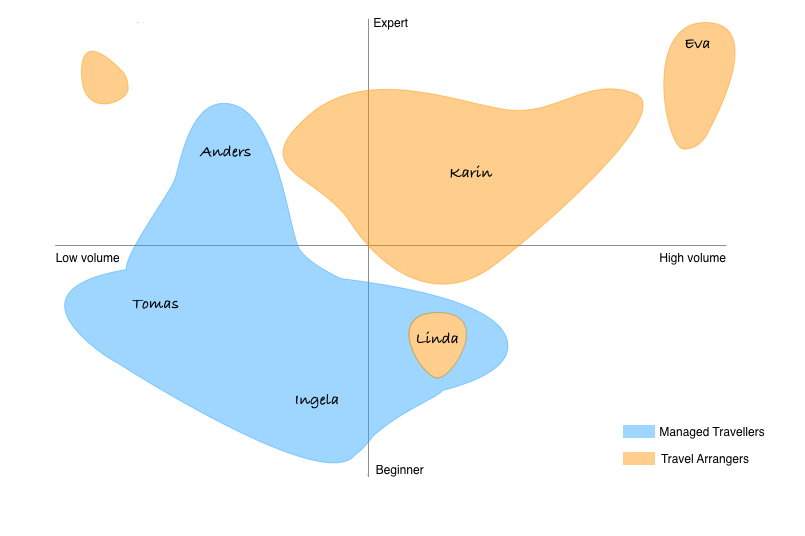
The names that can be read above are the different personas that I found. More on them below.
The research, mainly contextual interviews, gave me an understanding of the users’ behaviors, problems and needs. The first version of this result after analysis was a spreadsheet, it ended up being a flow diagram and some bullet points. The developers especially liked the flow diagram, I guess this is because they use this visualization tool themselves a lot.

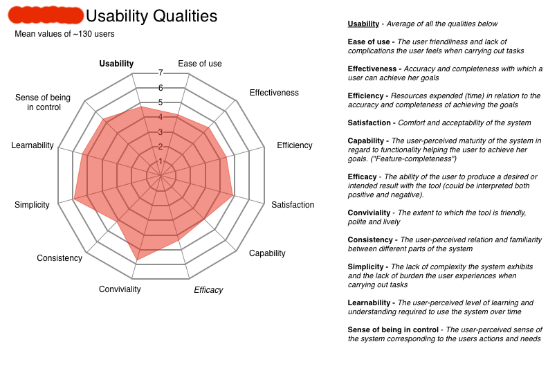
I always measure the user experience in some way during research. In this case it was the current experience that was measured, to work as a baseline for product development. I visualized it in a radar chart, and also explaining the different qualities of use on the same page. Read more about measuring the usability here.
I spent quite some time visualizing different subgroups of users with this kind of graph. Using this together with user characteristics and general behavior, I managed to weed out several clear personas.
I started with the two kinds of users that they already knew about, and did not dig in deeper on these since these were boundary users and not the main target group. But, I made sure that their differences when it came to how usable they found the system was clearly shown in a graph. I also added a quote to emphasize the problems these users have.

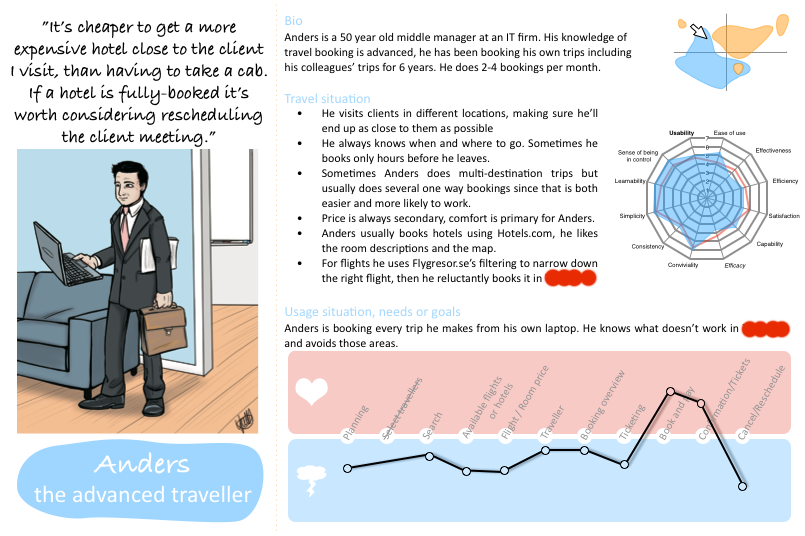
In the following personas, I’ve added a user journey, to visualize their satisfaction (or dissatisfaction) with the different steps they have to take to complete their primary task in the system. This helped immensely when deciding which parts of the system to rebuild, and explained why some parts could be left alone, even if a lot of my colleagues wanted to change those as well.
I hired a very talented comic artist, Yvette Gustafsson, to bring these personas to life. These two, Tomas and Eva, were surplus sketches Yvette did for another project, but I used them here too. The following persona illustrations were meticulously created in collaboration to make sure the character matched the characteristics.
Without further ado, here are Ingela, Anders, Linda and Karin.


A thing to remember is to add whatever is needed to interpret the visualization. I added a part explaining the research that had be done and one detailing out the work to be done based on this.
It is important to understand that this was not a one-time visualization of the result. I continuously updated the information, changing both the content when I had new information and the format to fit the intended target group.
This wall ended up in two places in the office, one where the development team (including the product owner) sits and also in a common area (actually the kitchen) at the travel agency to make sure the information was sufficiently spread in the organisation.
One problem with these visualizations is that people tend to like different kinds of visualizations. I believe most people got at least something out of these. One comment I got from a lot of people was that there was too much text. I tried to rephrase, use bullet points, cut some out, but in the end, the information needed to be there. I also got some people saying they wanted to know more, asking if I had a more verbose version somewhere.
Another problem is that people might want to read this on their computers instead of on a wall, but that will require a version handling of rang, and old versions circulating long after the project is over. I tried to avoid this, but I did find an early version of the visualization laying in a conference room in the other end of the building many months later.
But, all in all I did get a lot of praise from my colleagues and also a little feedback, which means it worked.


Leave a Reply
Want to join the discussion?Feel free to contribute!